I
SEPARATION OF THE MARK FROM THE HAND AND SURFACE
Almost immediately after Apple Inc. introduced the Pencil Pro in 2024, users noticed a subtle detail on their iPads’ canvases. The tablet screen projected a pixel silhouette of the Pencil, in context to the screen. The Pencil’s virtual shadow as a user-experience (UX) effect offers an intriguing phenomenological study of mark-making and the relationship between the hand/tool and the surface of which sign is produced.
Taking the broadest definition of the word “mark”, shadows can be thought of as humanity’s first “marks” on the world. Though impermanent, shadows cast by the overhead sun or silhouettes projected by campfires in dark caves were perhaps our first “images”. Then, with the fire’s soot, more permanent marks like stencilled handprints were made on cave walls. Tree barks were scratched, marks carved into clay/stone. For tens of millennia, marks made by hand were guided by sight. Marked surfaces were always close to our digits, with the eye witnessing the hand/tool directly contacting a surface to imprint.
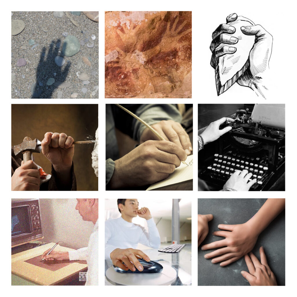
The 20th century first saw the separation of the hand from the mark. Handwriting was replaced by mechanical typewriting, then analogue turned digital. RAND released the first real-time, screenless digital tablet, marking a significant shift—a diversion of mark-making away from the marked surface. Hands marked the tablet, but eyes roamed a screen separated from it. The eye no longer sees the marks being made directly. They are now displaced from their surface.
By the 21st century, the separation became even more pronounced with the advent of machine learning. Part of the anxiety surrounding AI-generated images stems from the hand being so far removed from the process that we no longer see the marks being made. Prompts keyed in by hand are sent to servers far away and return as images. Essentially, we were drawing in the dark, despite using light-emissive screens.
Attempts to reconcile the hand and mark have been made with technologies like touchscreens, finger gestures, and styluses. The shadow of the Pencil Pro is more than just a gimmick. It is cast by the anxiety of the hand’s separation from the mark.
II
SEPARATION OF THE MARK FROM THE MEDIUM
Before the digital age, type had been intrinsically linked to print. Mechanical processes enabled the standardisation of previously hand-scribed letters, paving the way for mechanised typography and the concept of a “typeface”. From movable woodblocks to punch-cut lead type moulds and lithography, typefaces had always physically manifested through an image carrier and ink imprinted onto paper. There was a time when the term ‘press’ was synonymous with “type”.
Dove Press was an influential British private press founded by book designer T. J. Cobden-Sanderson and bookbinder Emery Walker around 1900. The press is famed for the Doves Press bible, typeset using their exclusive typeface, Doves Roman (based on a 15th-century Venetian type drawn by Nicolas Jenson). By 1909, their partnership had become untenable and had decided to part ways, beginning a bitter dispute over the ownership of the prized typeface. Refusing to relinquish control over the typeface to vying competitors (and Walker) after dissolution, Cobden-Sanderson successfully decommissioned the typeface by discarding more than a ton of lead type sorts into the Thames River under the cover of the night, systematically over a few years.
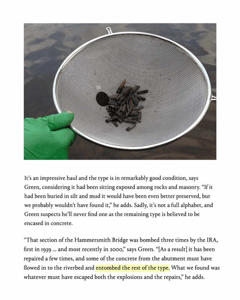
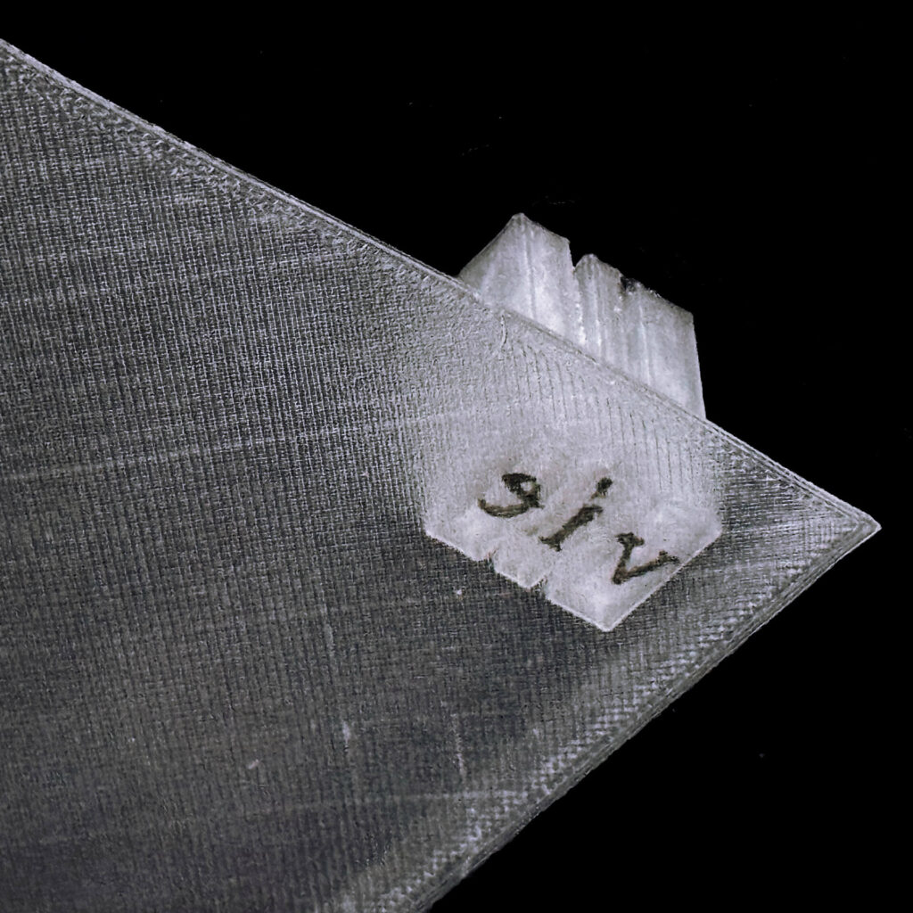
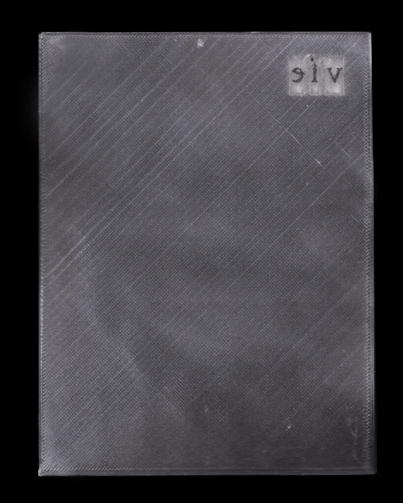
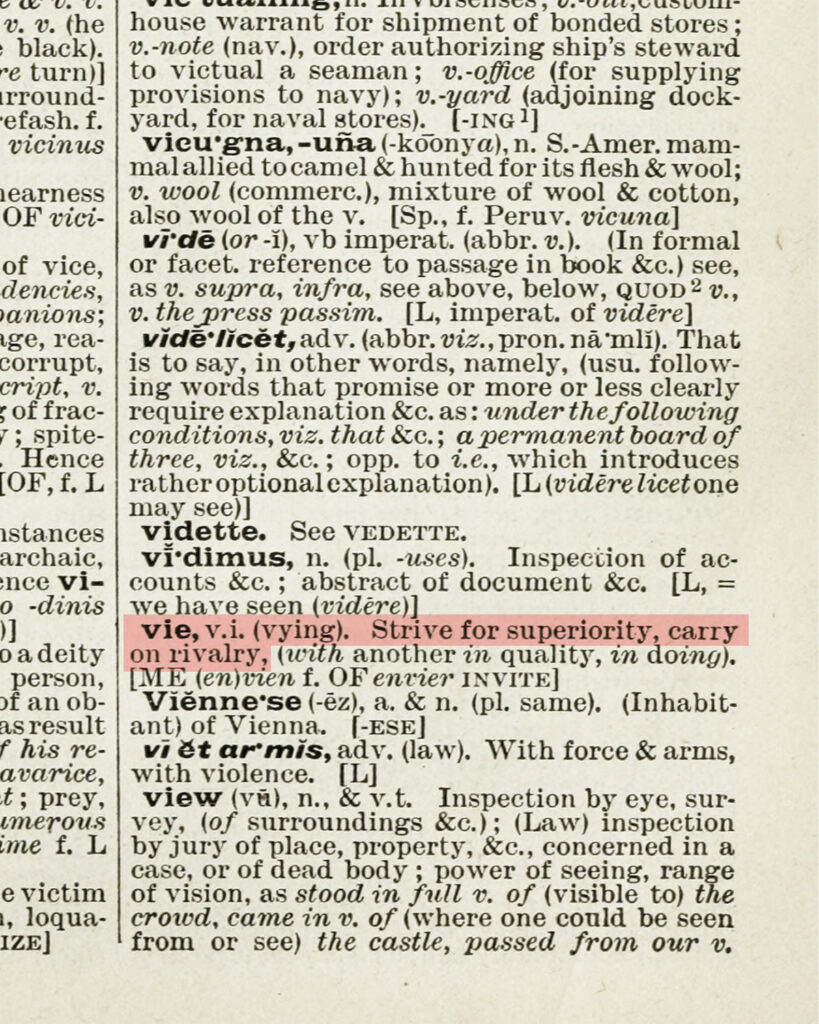
The type would remain in its “watery grave” under Hammersmith Bridge for almost a century, till 2014, when type designer Robert Green, who had successfully located the exact dump location through Cobden-Sanderson’s diary, decided to single-handedly exhume the lost type. He found the first sort, a lowercase “v”, followed by two more in his first search: spelling “v”, “i”, “e”.

While we do not have records of Cobden-Sanderson’s last words, the first words uttered by the exhumed typeface seem to hint at a certain vocabulary, imprinted by a bitter separation. Hundreds of sorts have been found since Green’s efforts, enabling him to successfully digitise a faithful revival of the lost Doves Roman as data in a font file. Typefaces no longer require physical sorts or even print to manifest. This is an instance of the separation of type from print (and its physicality).
Type cannot die because it is no longer bound to physical forms.
III
SEPARATION OF THE MEDIUM FROM THE PLANE
The word volume has etymological roots in Latin “volumen”, (as early papyrus rolls were called) derived from “volvere”: meaning “to roll”. The name remained with books even after parchment enabled folding, stacking, and binding of pages (early codex formats). The word was borrowed by the English language from French, and by the 16th century it had come to refer to the size/extent of a book. This eventually led to the sense of the word referring to the measure/amount of space any object occupies.
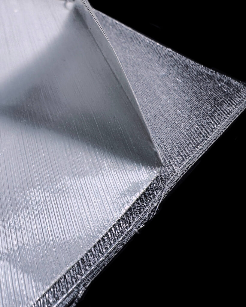
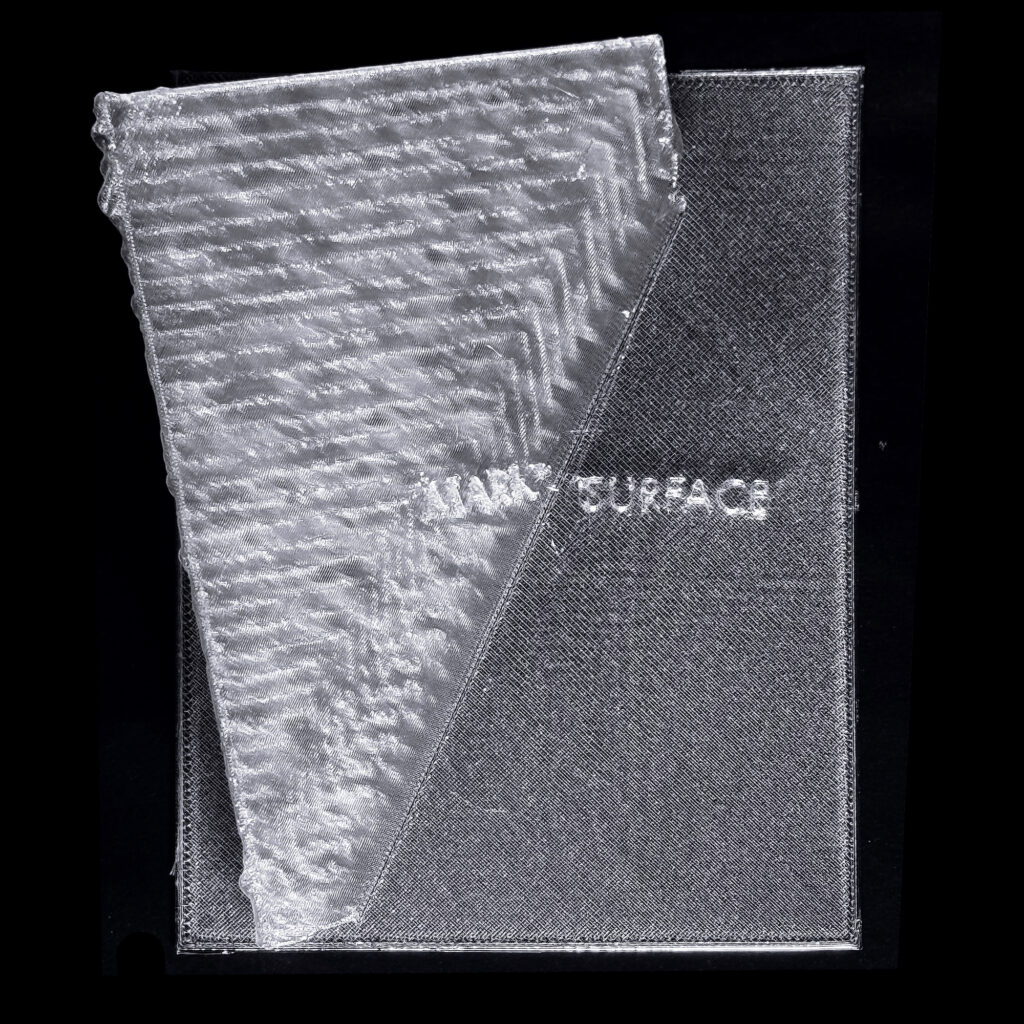
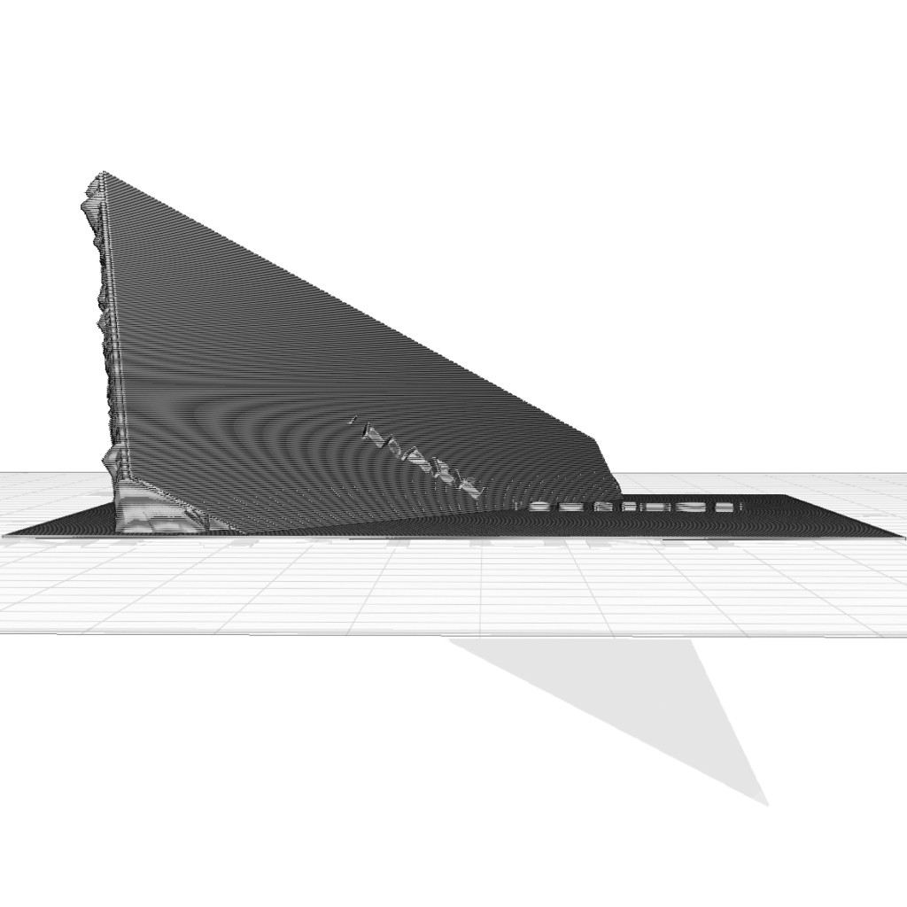
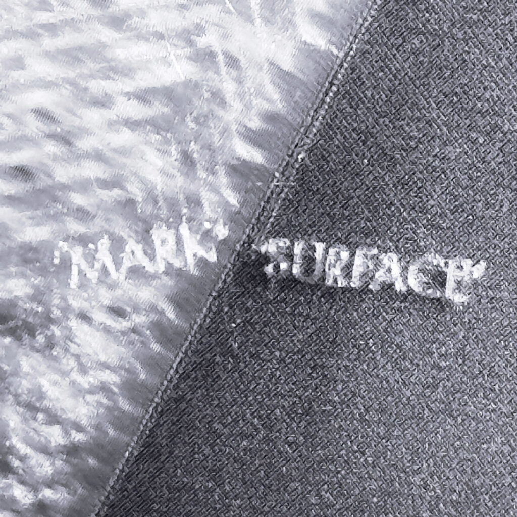
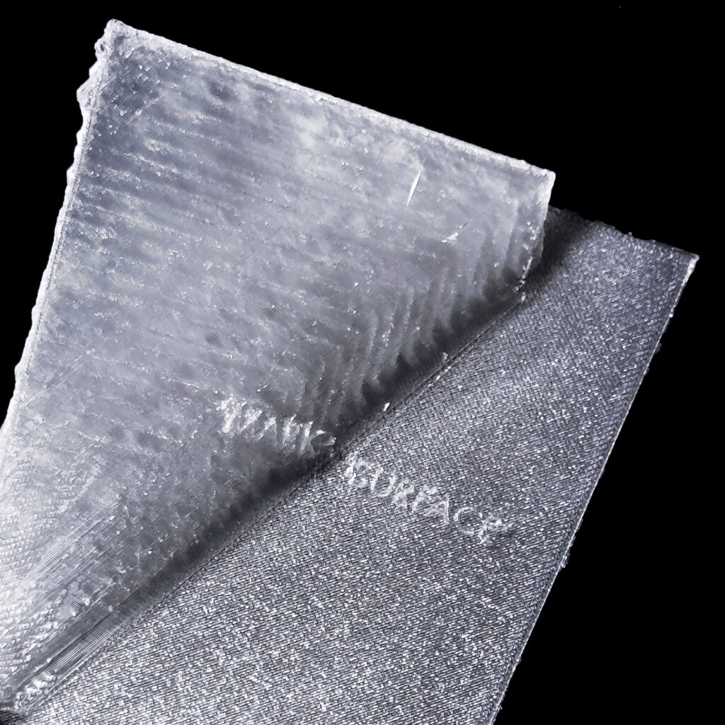
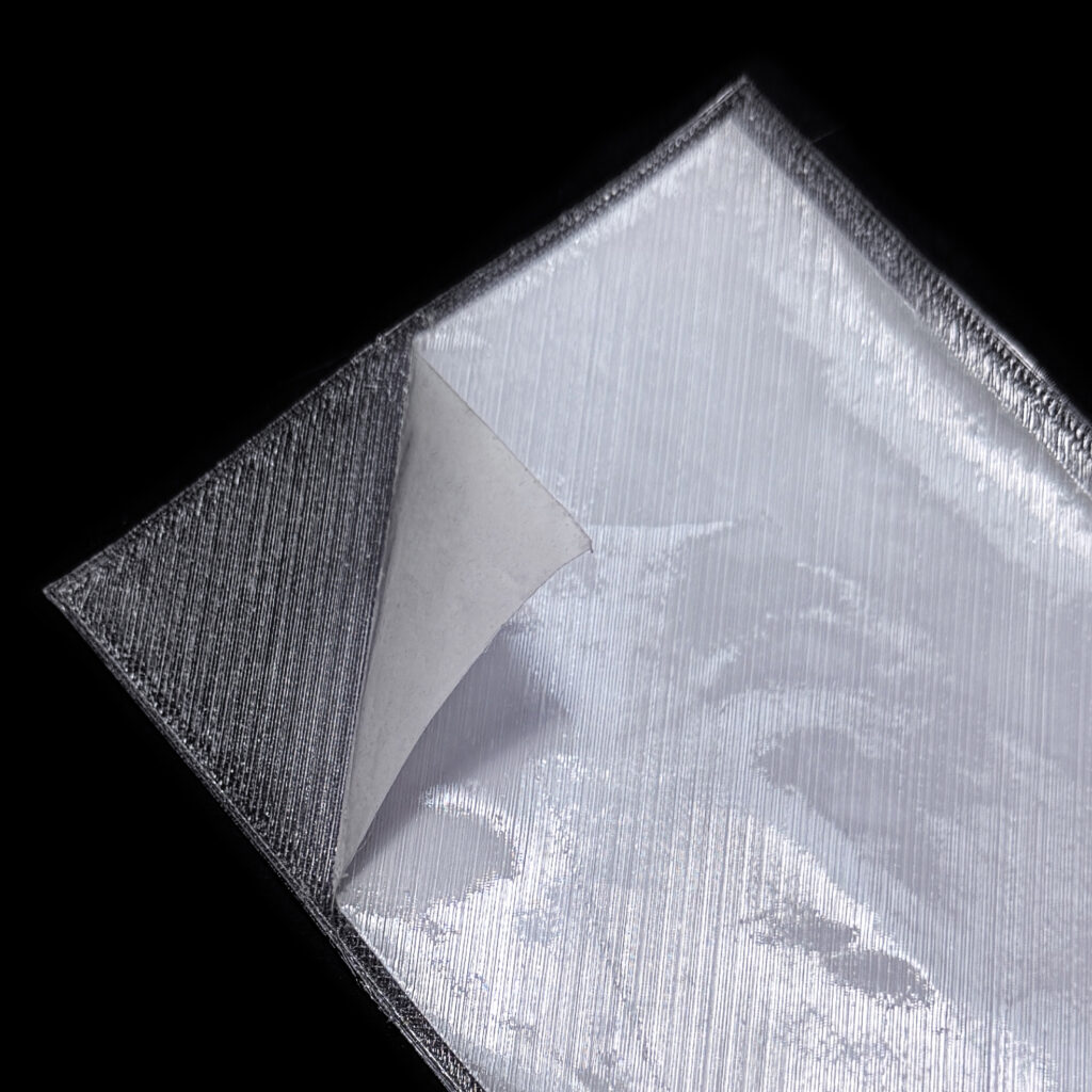
paper partially encased within 3D printed TPU leafEtymologically speaking, the word “volume” has been rooted in the “book” long before it signified the measure of space. By volumising the press, 3D printing returns the book form to its roots.
3D printing over pulp paper, encasing it within the print.
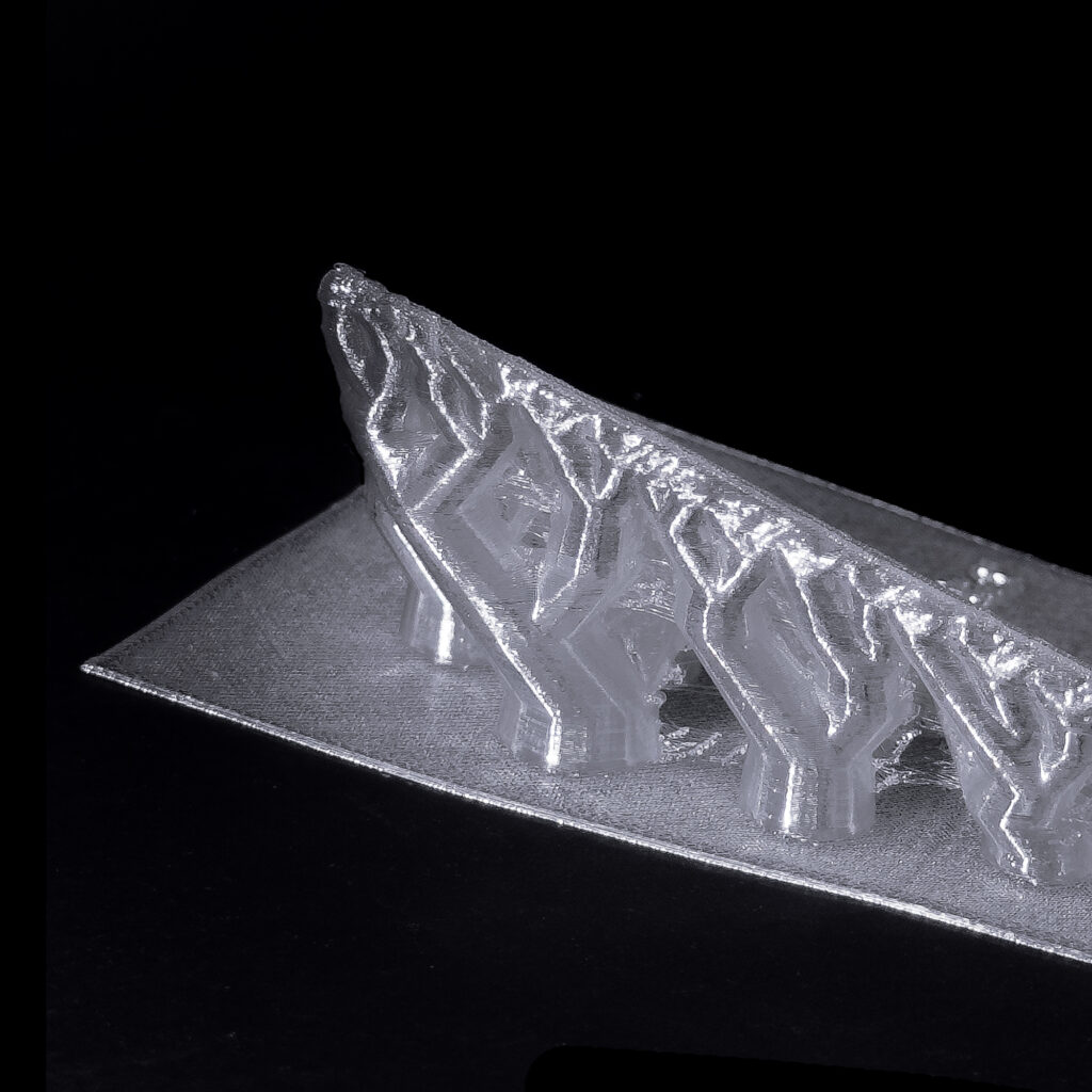
Aside from the print bed, most 3D printing processes are no longer confined to a flat, planar substrate like paper. The output, along with the print medium, has been volumised.
With 3D printing (and even 4D printing) ushering in a dimension-agnostic era for mechanical printing processes, the medium of print has left the plane.
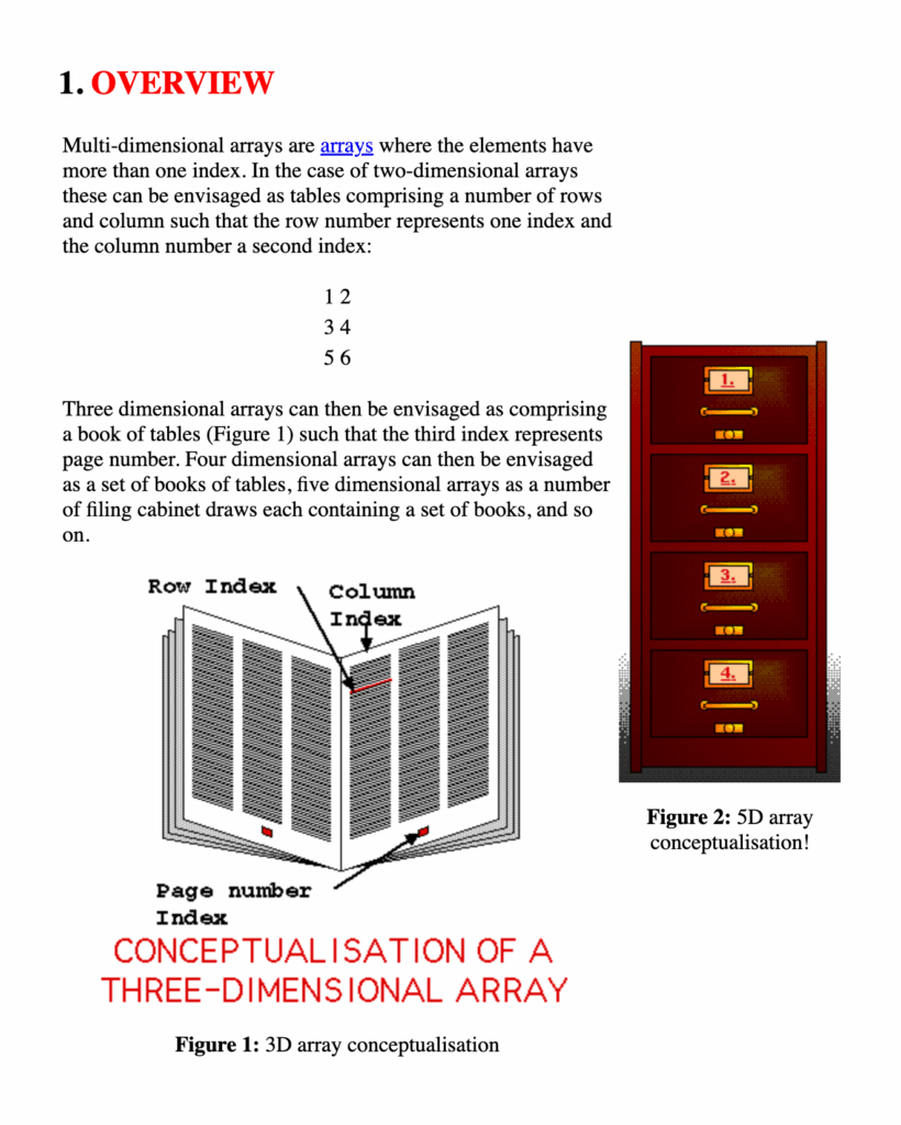
Frans Coenen,Multi-dimensional Arrays