One of the primary challenges with 3D printing books is the reproduction of small text. Fused Filament Fabrication (FFF) adopts a path-based printing process with a traversing mechanism. The printhead navigates a calculated path for optimal efficiency, depositing molten material at specific coordinates within a 3D Cartesian (X, Y, Z) volume. FFF prints each slice of the 3D model as a series of paths, resembling a mechanical scribe “writing” rather than through a printing plane like conventional planographic printing. This traversal mechanism is what enables 3D printing functional books, in a step-by-step process: from printing the page substrates, to the marks on individual pages, and eventually to binding these pages together.
This traversal mechanism poses intricate challenges when it comes to 3D printing books, especially for reproducing small text details. Achieving high print fidelity in small 3D printed texts requires a purpose-built typeface tailored to the mechanisms and materials of FFF. Similar to twentieth-century typefaces that incorporated ink traps for conventional printing to produce crisper edges, typefaces for 3D printing must account for corresponding technical considerations. In conventional printing, ink traps are typeface design features, like small notches in the corners of letterforms that act as micro-reservoirs to compensate for excess ink spread when printing small text. In FFF 3D printing, however, the challenge lies not in ink spread but in the viscosity of heated thermoplastic, which naturally causes material build-up as the extruder deposits voluminous material onto surfaces. Even simple manoeuvres, such as sharp turns or intersecting strokes, can lead to accumulation at these points, affecting the finer details of letterforms. This issue is further exacerbated when printing flexible materials like TPU, due to the need for minimal or no retraction. In place of ink traps, 3D printed text could employ an analogous method proposed as path traps: deliberate typeface design features such as diverting lines and strategically separated joints to redirect the FFF printer’s toolpathing, minimising material build-up.
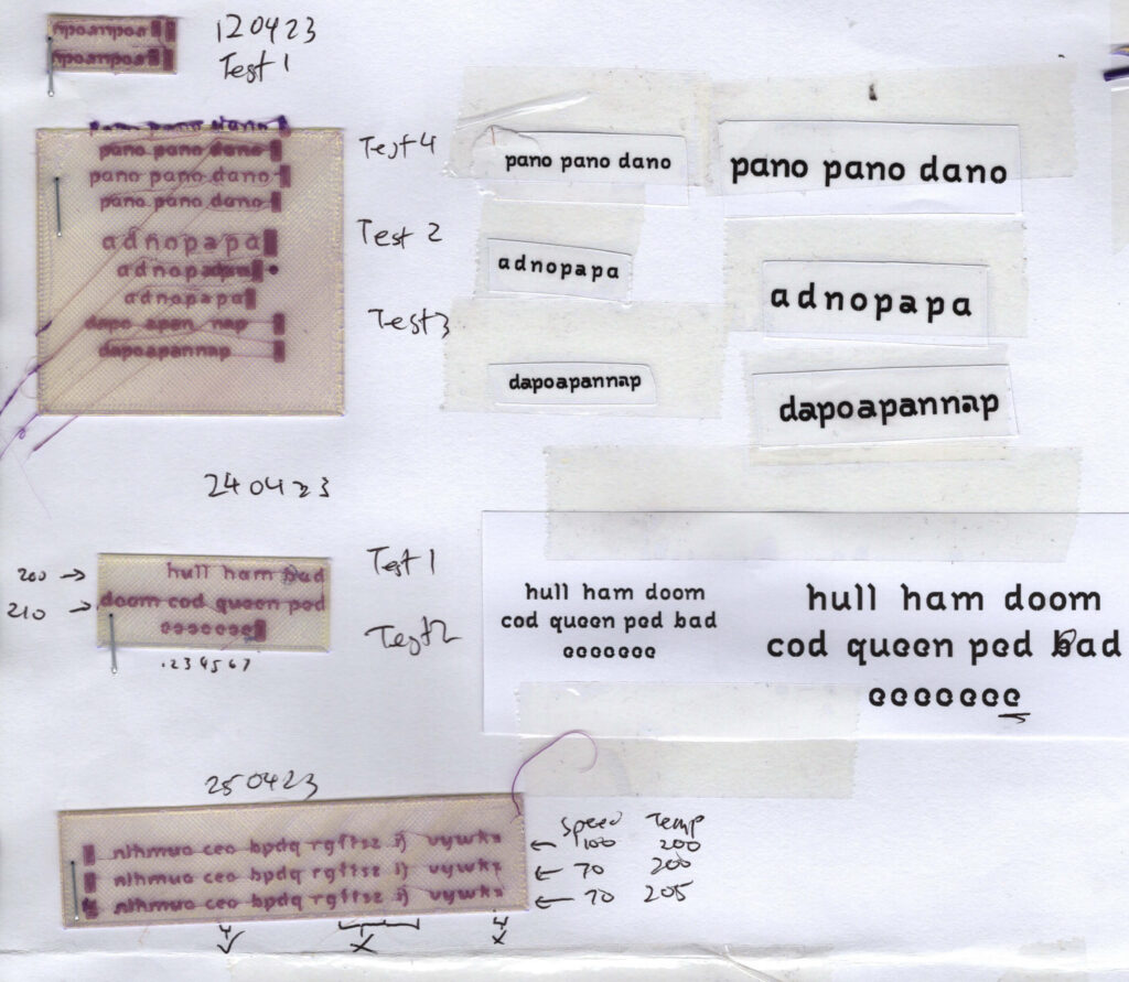
Fig. 1. Early tests for Labyrinth, a purpose-built typeface for 3D printing small texts
Prehistoric labyrinths were believed to serve apotropaic purposes. In ancient Greek mythology, the Labyrinth was a structure built by Daedalus to hold the Minotaur. In general, labyrinths (unlike mazes which are designed to confuse those who enter) has one entrance (and exit) with the objective of getting to the centre and return. It serves to slow down intruders (spirits) who enter.
Labyrinths serve not just to entrap the entrant, but to control the speed through constraining routes,
and in turn ┐
the path
The 3D printer does not ‘read’. Designed to print objects in layers, it often assumes every printed shape as a layer of the shell of an object that needs to be encircled. Due to this circuitous nature of the printing path, letter strokes require a different set of considerations:
1. Letter strokes need to be width-ed for encircled pathing.
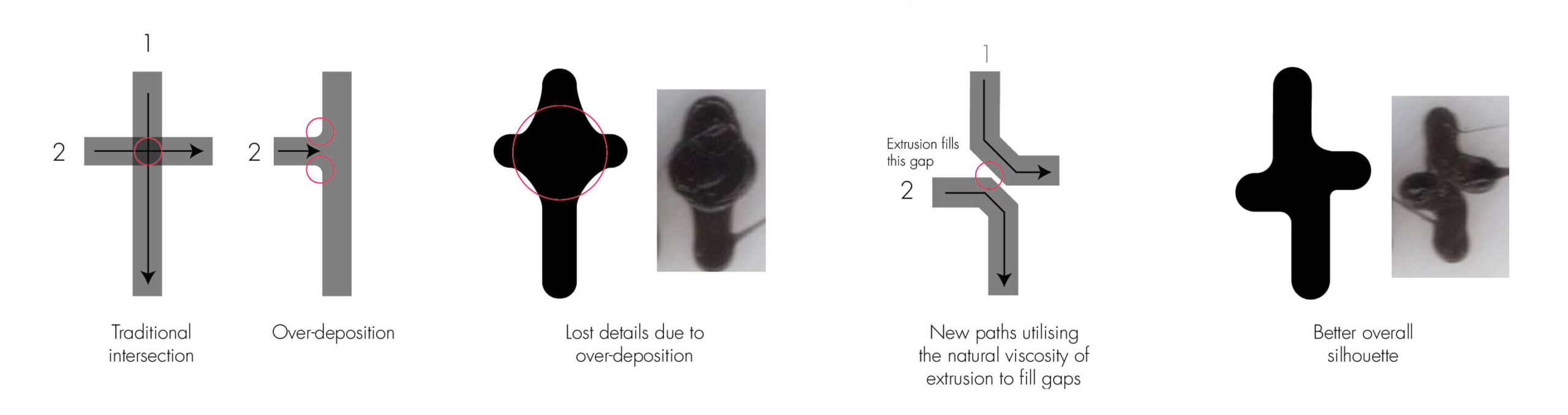
2. Intersecting lines will over-deposit material at the intersection, resulting in lost details
3. Printing path is calculated by efficiency (by default, closest neighbouring point), not logic (left-to-right)
Labyrinth is a typeface designed with pathtraps to improve the process and outcome of 3D printed texts, addressing issues caused by the traversal mechanism (Fig.2) of the 3D printer. Based on the default pathing logic of Cura Slicer (tested on Version 5.9).
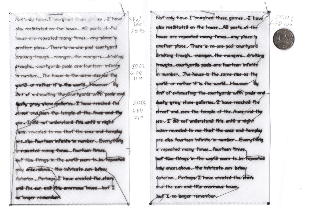
Fig. 2. Labyrinth traversal path tests
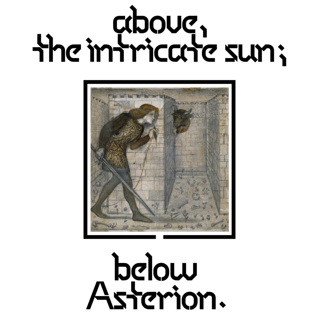
According to the Greek myth, Daedalus, designer of the Cretan Labyrinth containing the Minotaur, was almost unable to exit his creation due to its complexity, barely escaping death. Entrants since had not returned.
When Theseus volunteered to enter the labyrinth to kill the Minotaur, it was said that Ariadne (the princess of Crete who fell in love with Theseus) provided him with a ball of thread (together with a sword) to aid/guide him in successfully retracing his way out.
3D printing’s traversal mechanisms calculate routes based on the efficiency of entire paths, considering both proximity and positional values. While printing texts, point connections are based on proximity rather than logic, often connecting ascenders/descenders of surrounding letters, sometimes across lines rather than completing the text line, resulting in strays and tortuous paths across text blocks and paragraphs.
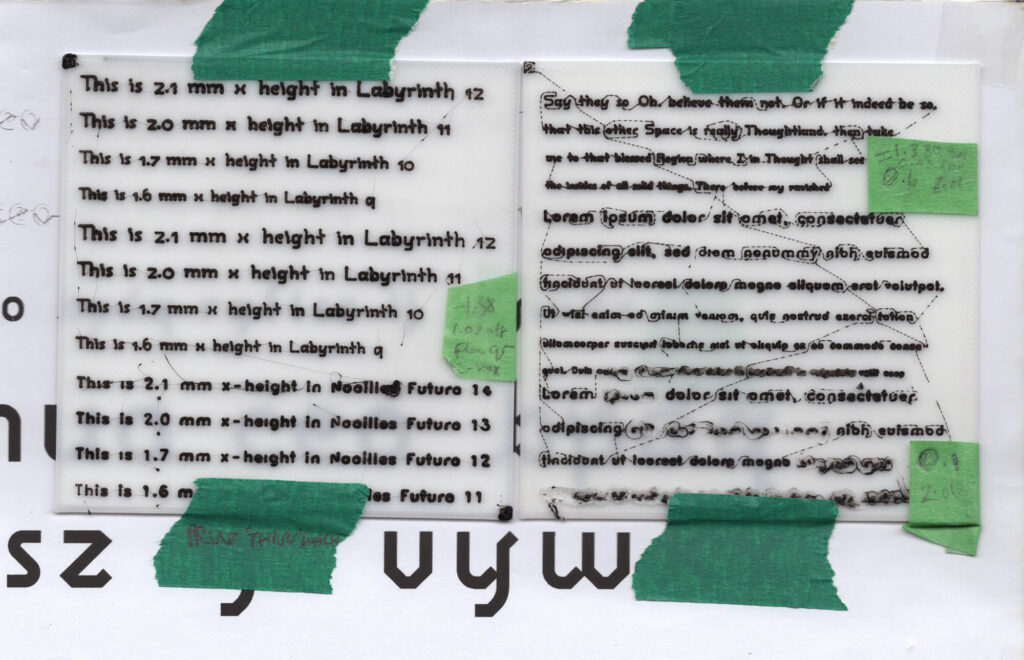
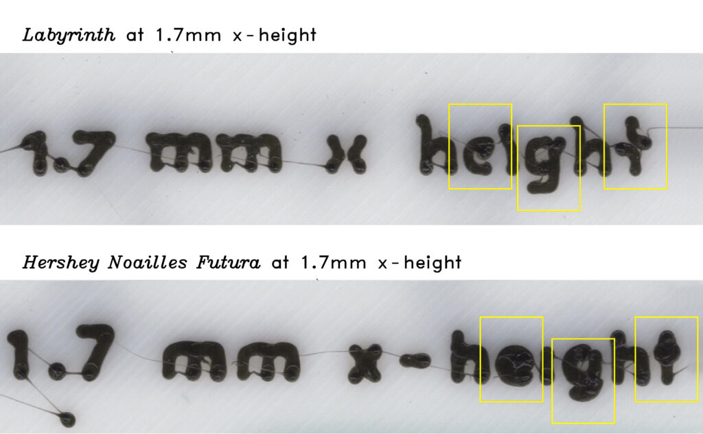
Fig. 3. Fidelity differences between Labyrinth and non-path trapped typefaces at 1.7mm x-height printed in PLA.
Path traps form stylistic features naturally through considerations of material deposition and pathing. While ink traps sometimes function to preserve the stylistic details of the typeface—its own defining features, such as the micro-reservoirs at joints, are sacrificed at the smallest print sizes, filled up by the ink spread in print.
Labyrinth introduces strategic segmentations in letters such as “h”, “m”, “n”, and “u” to minimise build-up at joints (Fig. 3 and 4). Letters with small counters or apertures, such as “e” and “g”, are specially designed to prevent material from closing apertures or filling counters. Cross strokes, such as those in “t” and “f” are omitted, relying instead on the natural spread of filament to merge segmented perpendicular strokes (Fig. 5).
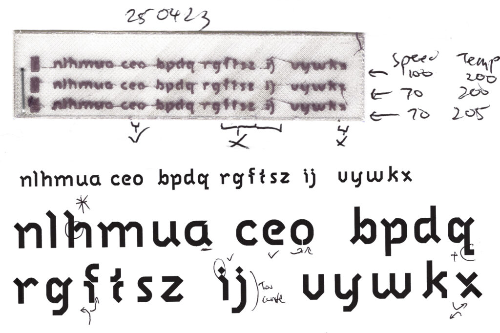
Fig. 5. Crossstrokes, apertures, and counter details
Fig. 5. Separating components of letterforms to redirect the traversal path to end slightly towards the right rather than back to starting points.
Uppercase letters feature exaggerated widths and cap heights to allow more stroke space. Using a path-trapped typeface, the 3D printer can print legible text as small as 1.7 mm x-height in flexible materials with a 0.4 mm nozzle. Sloped terminals help to notch the end connection points of each letter slightly towards the right (Fig. 6), increasing the chances of connection to the adjacent letter. By using these design features to disrupt and redirect the toolpaths, possible routes can be narrowed down, manipulated, and eventually constrained to a predictable behaviour. While path trapping increases the probabilities of traversing adjacent letters, adjustments still have to be made at the line level (by exhausting rag options) to guide the line-to-line traversals for cleaner results. Zig-zag (back and forth) traversal is also the preferred method of printing paragraphs line-by-line for efficiency.
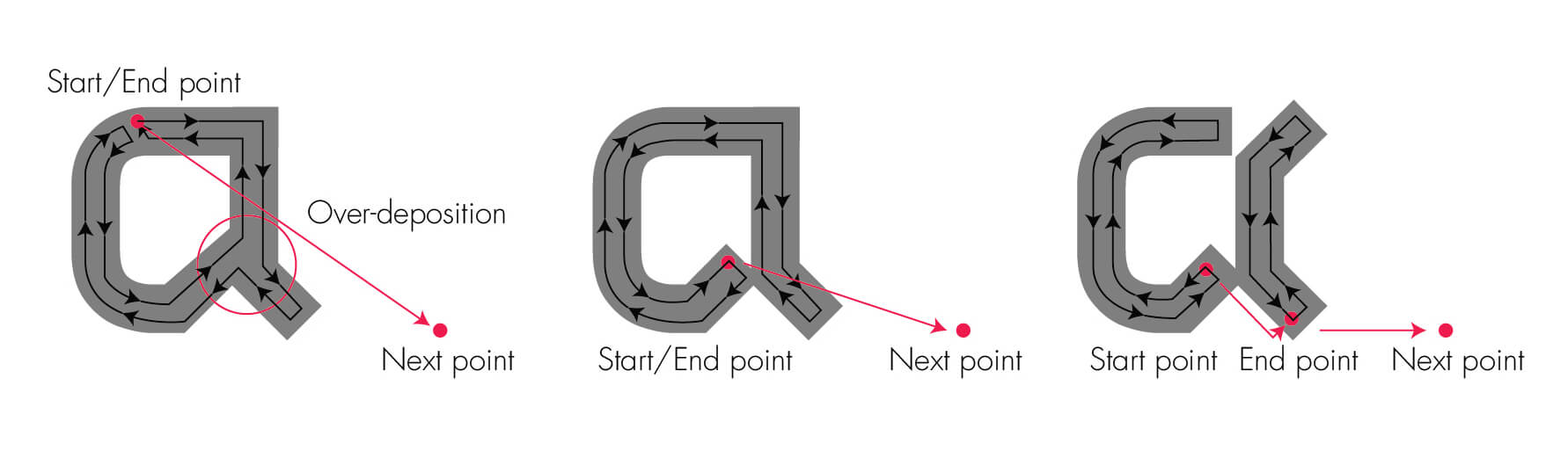
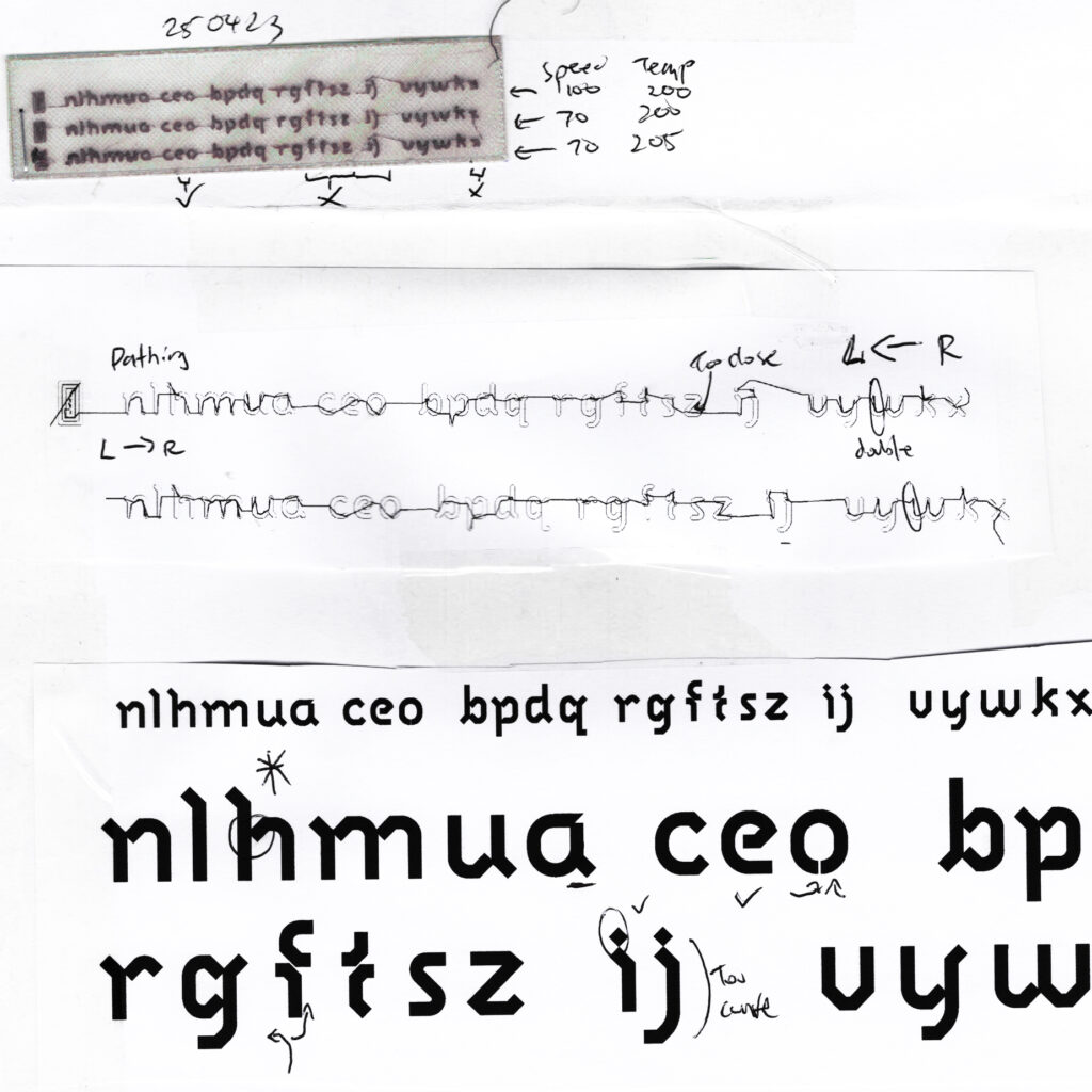
Fig. 6. Pathing details of Labyrinth from a Cura-sliced G-code.
Ongoing advancements in FFF and desktop 3D printing are obviating the need for purpose-built 3D printing typefaces, as improved slicing algorithms and finer extrusion capabilities can increasingly accommodate small typographic details. However, it remains evident that text printing (and by extension, typography) has never been, and is unlikely ever to become, a primary focus of 3D printing and additive manufacturing as a whole. Path trapping, therefore, persists as a typographic, design-driven solution that can be developed independently of advances in 3D printing hardware and software, while playing a pivotal role in bridging the landscape of 3D printing and the conventional printing press.
Despite their name, path traps do not entrap but instead guide the printer’s toolpath. Akin to Ariadne’s thread1, they free the 3D printer from the constraints of rendering small text and act as a guiding thread as it navigates the domain of the printing press. For the 3D printer, each letter is a path, cyclic and tortuous: words threaded through a unicursal line, line-to-line a puzzle, each text a labyrinth.
Labyrinth is still a work-in-progress, and have currently only been deployed in METALLY (2025) and On the Nature of Volumes (2025).
[1] Other than the Cretian myth reference, Ariadne's thread also refers to a programming function used to solve logical problems with multiple procedural options.